Finding the Color Palette That Makes You Feel Fabulous

Color palettes are PO-WER-FUL.
I’ve said it before and will say it again… Every single hue wields the superpower to set a mood.
We’ve all walked into a room and immediately felt energized, or calm, or maybe even unsettled. While there are a lot of elements that can inform this, I’m willing to bet that color is driving some of those feelings.
When we are designing a home, there are a couple of ways we create a perfect-for-our-clients color palette that exudes joy and warmth — or the exact mood they so desire.
First, let’s talk about color trends.
We always are giddy to see all the trends taking the industry by storm. At both Maison & Objet and High Point Furniture Market, earth tones took the stage with saturated, nature-inspired colors weaving into a softer side of neutrals.
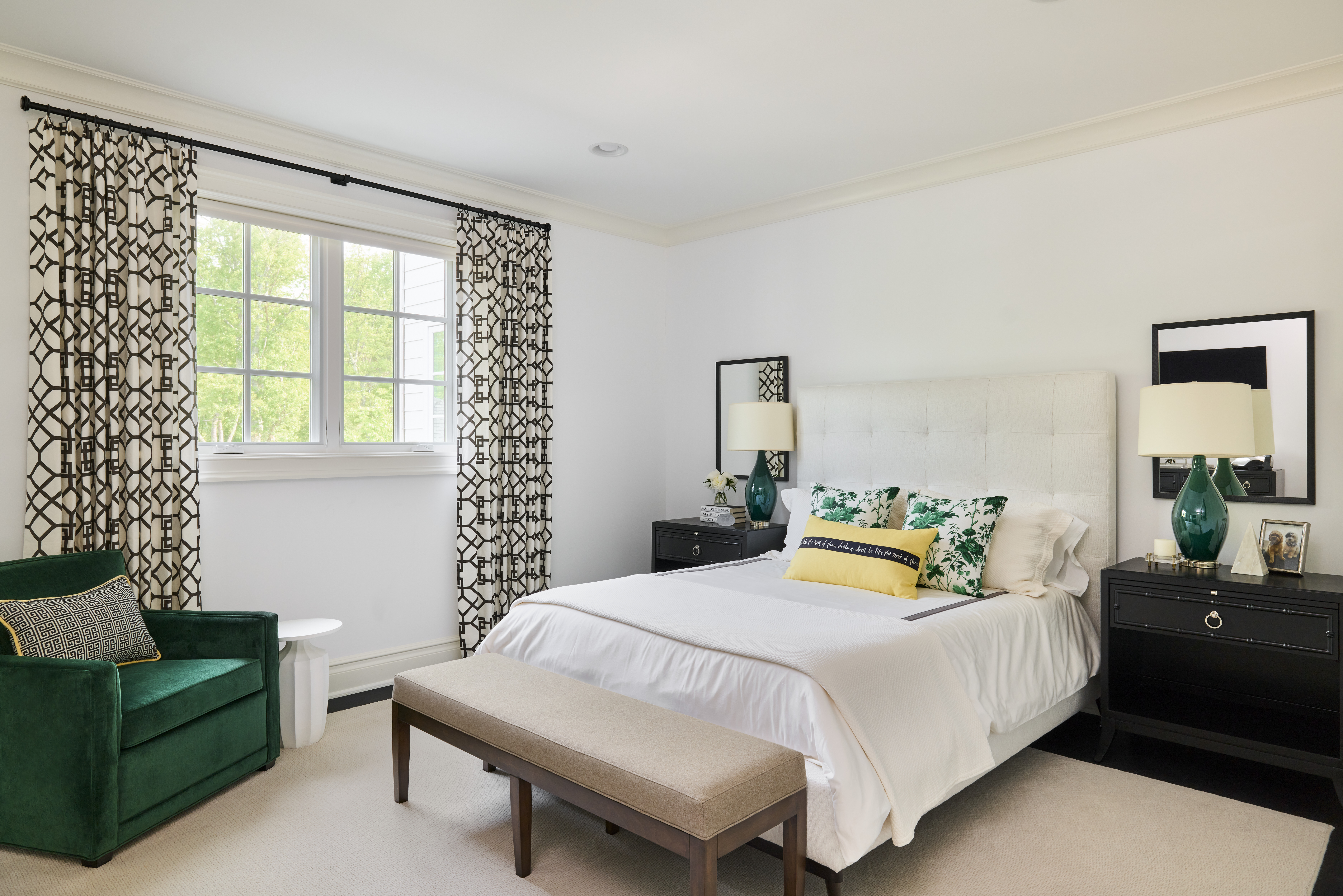
Imagine sumptuous emeralds, blushing beiges, whispering blues, and cozy camels.
The color, gray, which was a near obsession in recent years, has transformed into a much different application, showing up in accents like artwork, a side table, or perhaps a piece of upholstery.
I say all of this because, while trends certainly matter and inform our process and our inspiration — and our clients’ preferences — we never feel beholden to what the industry dictates.
Color is too personal for that.
We focus more on designing spaces and palettes for our clients that are timelessly modern and reflective of their unique design fingerprint.

How we think about color in every room
Painting by number in our process of design looks like being incredibly thoughtful about the palette we use in each and every space of a home — especially for a family who has multiple types of rooms and preferences.
Let’s start with the common spaces of a home. Here, we look at a contiguous color palette that both partners love. For example, that might be something more neutral like creams, navy blues, and a bit of gray.
In the primary bedroom, we lean into a color set the couple both loves — maybe it’s something like a softer sea-glass blue.
Now, for home office spaces. For her, it might be a soft, robin’s egg blue that evokes peacefulness and calm. For his office — and even a “man cave” — the palette may shift decidedly to a more high-contrast black and cream and white with a fleck of goldenrod to set a streamlined yet edgy tone.
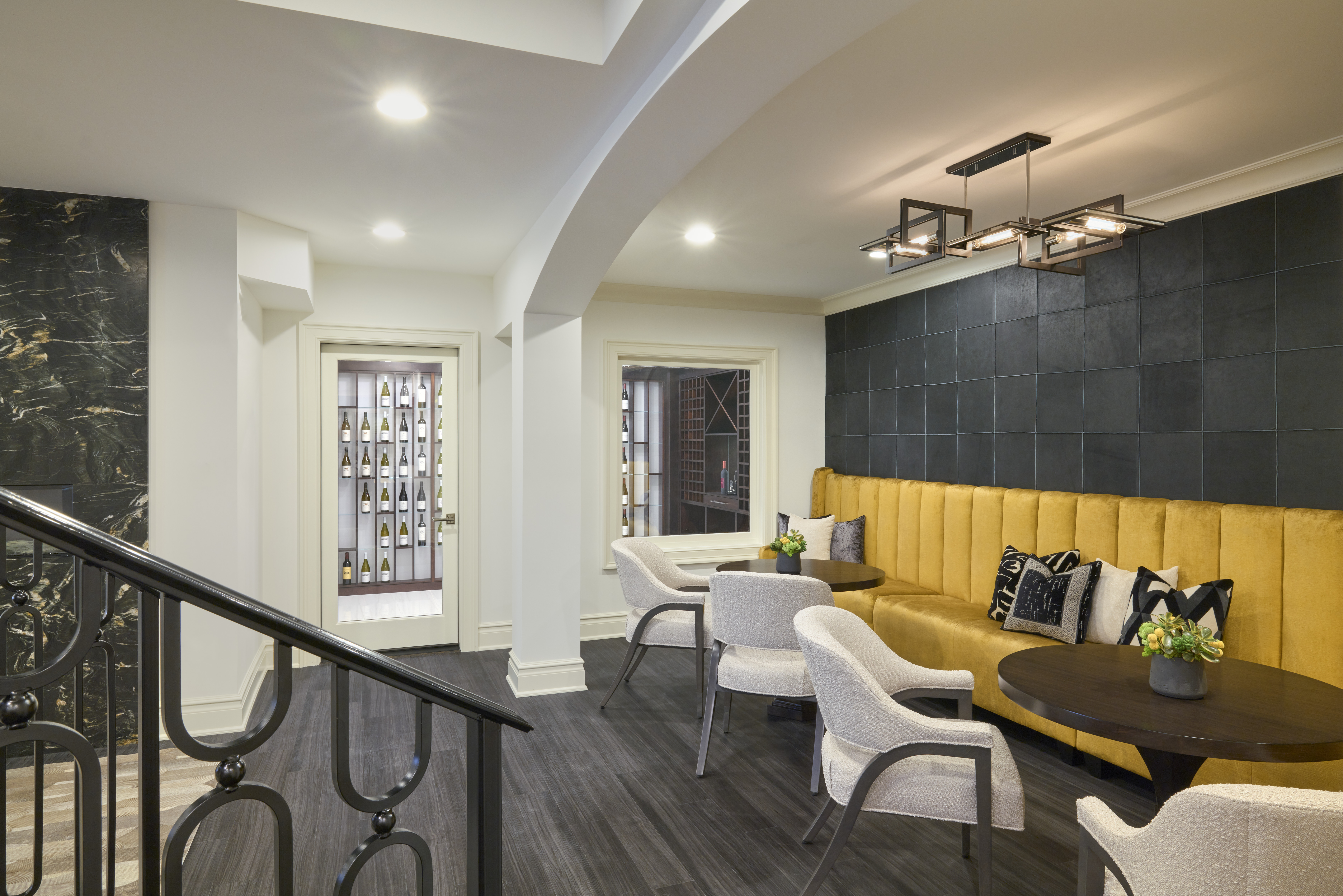
Speaking of goldenrod, we used this hue in a dining room juxtaposed with grays and pine green. How brilliant. It’s unexpected yet entirely beautiful.
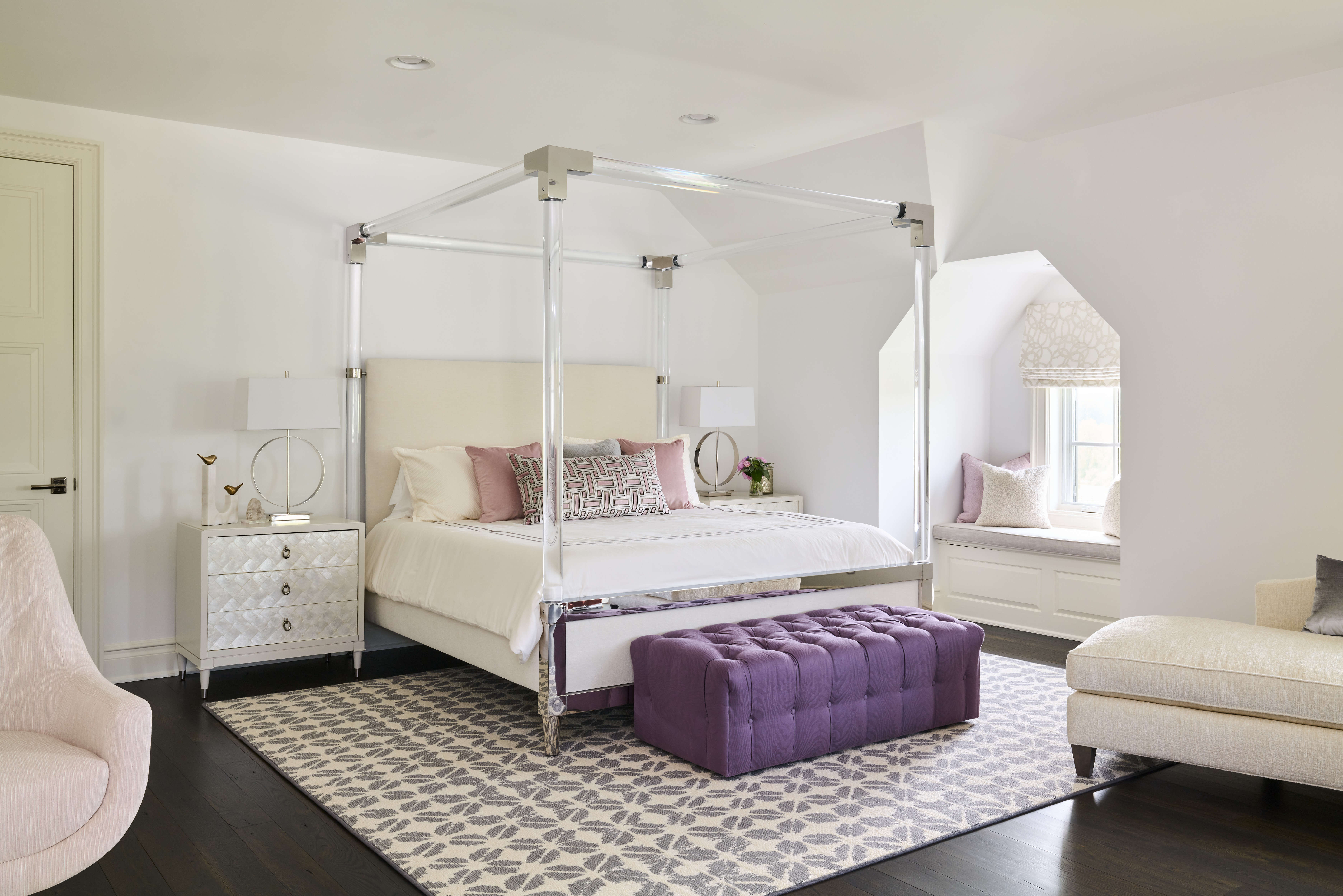
Now, there’s one more space where color can be a big focal point and that’s in kids’ bedrooms. We try to celebrate hues that the younger set loves being in and dreaming in. But we always have an eye toward what will be evergreen and compatible to their growing, changing lives, too, so we can create a room that will age well with them.
In this office, a custom rug underfoot adds comfort yet edge, with a black border to ground the space. We also tickled more touches of jet-black throughout with sculptural pieces and accessories.
Tone-on-tone window treatments frame the space with graceful softness without distraction to complete the look.

A flourish of artistic inspiration
Art in an office space is another thing that I love to use in just the right doses to add personality and inspiration. Across from the desk in this office is the most stunning accent wall that has been painted into an overscale mural. Radiating with rich tones of jade green and creams and whites, it truly acts as such a statement-maker in the space.
Because of this piece’s prominence, the artwork behind the desk is a tone-on-tone wall sculpture — selected with strategy for textural impact yet so as not to compete with the mural.
—
Want to write your own color story in your home and create a dreamier palette to envelop you in every room? Let’s spin the color wheel and look at ways to transform your space with the flick of a paintbrush. Start the conversation here.
 Luxe Magazine Residential Excellence in Design