The Power of Color for the Perfect Whole Home Interior Design
Color is an outrageously powerful driver in a space.
As such, it’s an element that radically shapes any space, from multiple rooms to our whole home design process.
At Impeccably Designed Homes by Donna Hoffman, we hear a lot about color trends and the Pantone Colors of the Year. That’s because color is on the mind of design clients and design lovers alike: Color affects us profoundly.
Even in the very words of Pantone Color Institute’s executive director Leatrice Eiseman, the power of color is palpable. “Colors for Spring/Summer 2023 are recalibrated for the new era we are entering. Blending escapism with reality, wholesomeness, and joy, we embrace the exploration of extreme contrast in mood and color,” she said.
While familiarity with trends is indeed important, I never feel tied as an interior designer to a specific palette when making a design decision for a client.
We see impeccable interiors as being more about how we integrate color into the landscape of the spaces we design for you, so that spaces are molded to you precisely. This is as true for a renovation project, a multi-room project or full home. Color in your life is not about cookie cutter, which is why we don’t feel bound by the limits of the color du jour.
Here’s why the successful use of color never goes out of style — and how it is such a power tool in our design belts.
Color sets the tone
Every single hue has the power to set a mood. We’ve all experienced walking into a room and having a sense of calm or peacefulness, or even being energized by the space. Color drives that vibe. Maybe you even felt a little unsettled in a space. Color probably had something to do with that, too.
Particular color combinations work in a way that can elicit a wide range of perceptions and feelings. But what you might not realize is that the artistry of color is also very mathematical. There’s a scientific reason behind why certain palettes are restful and soothing while others are exciting and vibrant — and maybe even raise your blood pressure a bit. Add in your specific design fingerprint and “the math changes” further still.
As interior designers, we a developed and trained eye and skillset to know how to strategically use color to enhance a space and to evoke just the right mood you want to live in daily.
Color creates movement
Both the type and placement of color also create rhythm and harmony in a space. For example, the staccato notes of a bold color pop in a piece of art, an accessory, or a contrasting accent wall all punctuate a space and provide a stopping point for the eye. Because our eyes look for differences — particularly changes in color — we use color very deliberately and strategically because we see it through our designer lens.
Color is contextual
It’s also important for us to remember that the success of a color palette — or even a particular shade — is very dependent on its context. What works well for the architecture, purpose, and layout of one room may be the completely wrong answer for another. In much the same way, color-combining plays a critical role here. Certain shades will enhance and feed off of others.
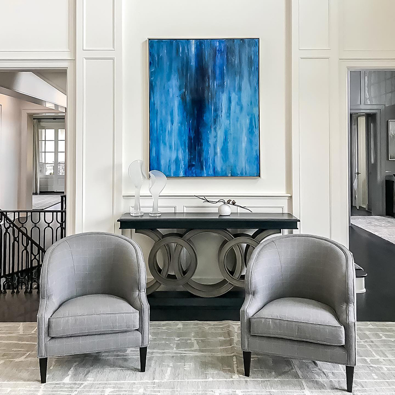
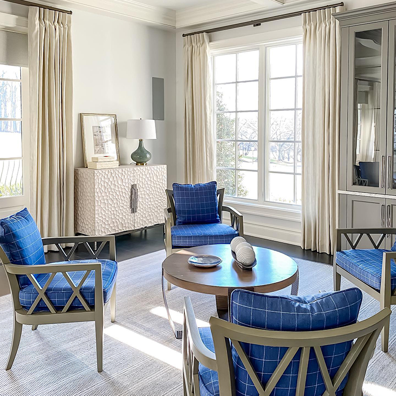
One more note: how color is used can completely change its impact and meaning. You can have the same shade of cobalt blue, but it can be translated in wildly different ways based on its dosing, placement, and style. Used in a highly saturated abstract art piece amidst a room filled with a sea of light neutrals, and that accent color is intentionally bold and beautifully intrusive. It is strategically loud and proud. The same color in the seating area of a sunlit conservatory hits much differently. While still bold and beautiful, it makes a softer, more fluid statement to create visual interest in a large room.
Color is personal
While there is a lot of designer logic and expertise that goes into selecting a palette, color is ultimately highly personal — and personalized — to our clients. To you. We all relate to color differently, including which colors and in what quantities and qualities.
For example, that same cobalt blue may be a dreamboat hue for one person, but it could be like nails on a chalkboard to another. And, taken another layer further, some clients may need a space dripping in color — floor, wall, windows, everywhere — while others might prefer smaller splashes in pillows or on accent rugs.
We use a specific “design fingerprint” discovery process to determine the precise colors and color values (and in what doses) our clients gravitate toward, so we can best reflect their unique tastes and lifestyle needs in our whole home design process.
This sensitivity and process is the reason an out of town client recently said to me, “Donna this will be our 3rd project together but your discovery process never fails to amaze me. You really “get it. I have no idea how you do it, but you do.” Let’s set up an initial phone or video conversation today to begin delving into the color wheel together — and maybe even color outside the lines a little bit.
 Best of HOUZZ