Kips Bay Decorator Showhouse Recap from a Top Bucks County Designer
I may be a Bucks County Girl & Designer – but I’m a New Yorker, born and bred. What a treat then to head back up to see what my NYC design colleagues are up to. And no better way than checking out the famous Kip’s Bay Decorator Show House…still benefiting after 38 years, the Kip’s Bay Girls and Boys Club….serving over 13,000 children.
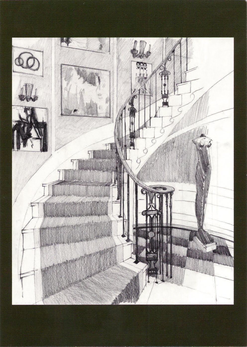
Design show houses may be great little jewel boxes for lay people and designers to float through. But they are really something more. Within the design world – what a show house really is – other than a designer’s expensive but great marketing opportunity – is ….a fabulous and freedom filled design laboratory for designers. Here we can stretch our wings, our imaginations and our design-commentary. In so doing…we inspire new perspectives and ideas for layperson and professional alike. Here are some noted trends from the Kips Bay 2010 Show House at 106 E. 71st Street, NYC. (Rendering here of the marvelously elegant foyer done by Rod Winterrowd, Inc.)
Ceilings, Ceilings, So help me Ceilings.
WOW. Nary a ceiling was left untouched. They were the respected 5th wall of the room – the important 5th wall that the great Albert Hadley cautioned designers ought not forget. And the Kips Bay Show House designers didn’t. These were wallpapered, they were ‘silver leafed” (actually aluminum-leafed so there is no tarnishing involved…smart….), they were coiffured, they were painted sometimes with the only color in the room. My hat goes off to Cullman and Kravis for their aluminum leafed “Dinner at Eight” dining room. So luminous by day…one can only imagine the effect in the evening by candle light. As an aside…sometimes mydesign clients out here in Bucks County, PA are a little stunned when they see that my color plan selections involve treating the ceiling…but don’t knock that ceiling treatment until you’ve tried it peeps. What great “life” and breadth a treated ceiling brings to a room. Before I leave the ceiling world…
The Ceiling Oscar goes to Noel Jeffrey for his pale yellow ceiling in his master bedroom pictured later in this post. His soft but sunny ceiling in the monochromatic interior makes a naturally dark NYC bedroom feel sunny, cheery and bright all the time. Clever.
Treated Walls:
Wall paper is back, back, back. This is not news …though not many clients here in the burbs are jumping on this train the way they are in the cities. So…if you’re a burb-dweller…read on. From grass cloth used subtly or set inside shadow boxing – to deliciously executed Venetian Plaster that was taken to a marvelous high sheen thanks to buffing, buffing and more buffing – to walls covered in fabric. Wall paper in refreshed retro prints was as frequently used as textured cloths, combed papers and so forth. The Lesson: There’s more to life than an egg shell finished painted wall, even if it is done in a great Ben Moore paint color…(Ben…still love you…)
Cut Up the Rug:
Make that…deeply carve the rug. The rich texture story of the walls and ceiling fell to the floor by way of exciting, deeply textured area rugs …mostly in neutral palettes. Most striking about them was how deep their dimensional textures really were …whether hand cut, or woven with a dramatic low and high pile. Wow! Exciting. Nice foot feel too. (Yes…it was me, the designer from Yardley that was on her knees constantly petting all of the area rugs to check things out… 🙂 )
Special Mentions:
I have to tip my hat to:
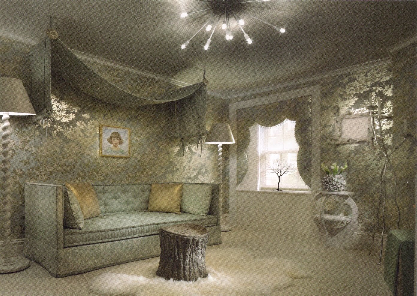
Elizabeth Pyne for her bedroom pictured above here. She wisely and boldly wrapped the oddly shaped room in a singular foil pattern and fabric in order to mute the odd angles and proportions in the room. Her mixture of textures – the rough, the fluffy and the smooth with the foil paper was spot on. Elizabeth Pyne is is young, bold and exciting…I expect great things from her. How lovely that she was on site to chat about her creation. Other hat tips goes to…
Noel Jeffrey for his master bedroom shown below, (the one with that delicious yellow ceiling I mentioned earlier.) Forget how 1940’s chic this bedroom is or how masterfully Jeffrey mixes 1970’s vintage with Hollywood glamour. Forget that formerly mentioned yellow ceiling to lend perpetual soft sunshine. Forget the way he causally tossed a single saffron yellow chair center stage in the room…literally just off center…to create some “I”m not even trying” design cool. Forget his marvelous work with sheers to soften the corners in the rooms as well as flit over the windows. No…forget his delicious artfulness for a sec. Let’s talk about what a gentle, kind, humble,thoughtful and generous man Noel Jeffrey is. He happened to be on site in his room when my colleague and I passed through. Listening to Noel Jeffrey speak about the interior and how he created it was like listening to Bach talk about how he created that little diddle The Brandeburg Concerttos with an “oh..it was nothing air of humility.” Thank you Noel Jefferey…you were a show highlight…as was your delicious work….even more beautiful than your photograph here shows. I’m a fan.

Well my peeps – I could go on – but you have places to go and people to see and so do I. The take away from the 2010 Kips Bay Show House show was crisp, clean lines cut with a great mixture of lush textures. Richly done walls, ceilings and floors were a highlight. Grays were still present in delicious abundance, but cut sweetly with creams and vanillas for freshness and life. Reverse painted glass found its way onto a kitchen back splash to excellent effect….I regret that I have no photo and as soon as I can figure out how to mount it properly…I have to do one for somebody! And if you have a sec – go google Nina Helms and check out here plaster wall sculptures. Terrific! Go Nina.
All in all – I left the show house as one should…ready to get back to the design drafting table…rarin’ to go and bursting with inspiration. Thank you to my wonderful NYC design colleagues!