The Power of Contrast: Mixing Light and Dark Elements for Impact
Let’s talk about one of my favorite design power moves: contrast. Nothing wakes up a room faster than the dance — the push-and-pull — between light and dark. This kind of high contrast is everywhere in nature — from the pale glow of the moon against a deep, inky sky, to the chalky-colored bark of an aspen tree punctuated by charcoal markings.
It’s dramatic. It’s elegant. It always works.
At IDH, we love wielding the power of high contrast in interior design because it delivers timeless visual impact and it brings spaces to life.
Here’s how a well-balanced mix of light and dark tones can add elegance, energy, and just the right amount of drama — without ever overwhelming a space.

High Contrast in Interior Design
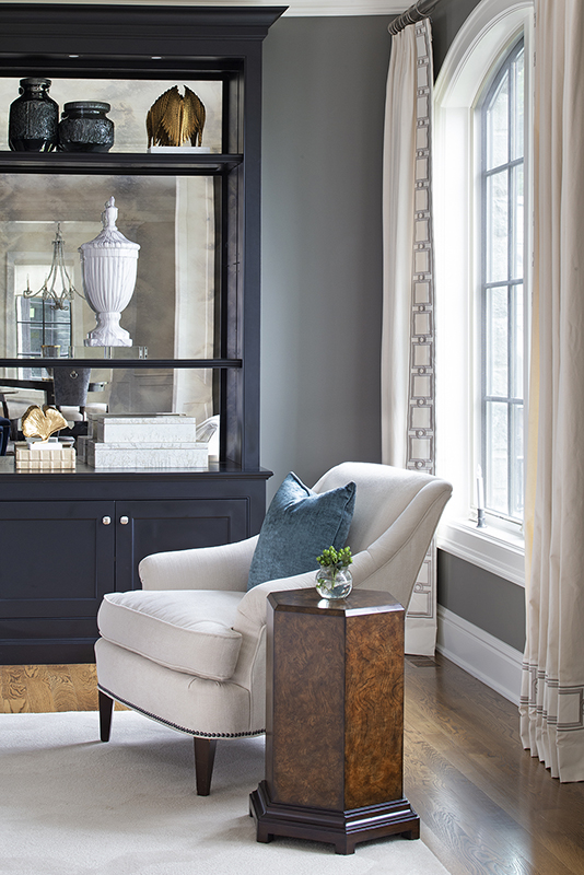
For one of our clients who adores shades of gray, we played conductor by layering deeper grays with creams and touches of soft black. The result? A sitting area that’s classic, sophisticated, and utterly unforgettable — it almost reminds me of a baby grand piano in the form of a room.
It’s important to see here that the interplay of tones isn’t just elegant and dynamic, it also maintains a warm and inviting feel.
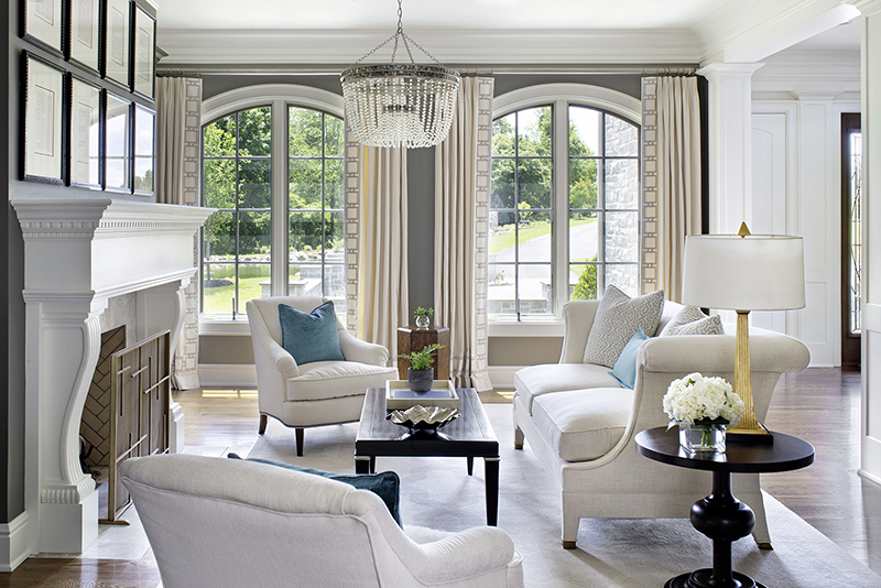
For another client’s living room interior design, we worked with lighter-to-mid tones that were accented by the staccato beat of darker elements — some that whispered and some that splashed slightly more attitude around. Is it too much? No; rather it’s engaging and beautifully balanced.
The Balancing Act
Here’s the thing: high contrast in interior design doesn’t mean you have to lean heavy on one side or the other — it’s about knowing when to dial it up and when to pull back.
Get the balance wrong and a space can tip and become lumbering, even oppressive, or too icy and cold.
I like to think of contrast in luxury interior home design like a well-balanced and strategized symphony.
If one section of the orchestra is too loud — like the flutes or the trumpets — you’re reaching for the earplugs. The piece immediately loses its harmony. You need the grounding of the deeper tones of instruments like the cellos and basses to create depth in the musical score.
Darker elements serve that grounding role in design — while light tones provide lift and brightness. Together, they make quite the stunning composition of harmony and rhythm and movement in a room.

Interior Design Tips for Light and Dark Spaces
If you want to explore adding more impactful contrast at home, there are a few golden rules to follow. Here are a few interior design tips for light and dark spaces.
- Anchor with dark tones: To instantly ground a space without overwhelming it, strategically choose where you’re going to integrate darker tones. It could be something like a deep charcoal sofa, black-trimmed windows and moldings, or rich wood tones in accent pieces.
- Layer your lights: Mix your whites, creams, and soft grays, so they feel rich — not flat and bland. At IDH, we also love to play with light, mid, and dark tones within a single palette for a sophisticated, layered look.
- Make it a conversation, not a competition: Light and dark should banter back and forth — not fight for the limelight.
- Borrow from nature: Mother Nature knows best — follow her lead and look to the outside world for examples of light and dark to spark more design inspiration.
- Bring in the experts: When it comes to creating impeccable high contrast in interior design,there are so many nuances. That’s where a luxury interior design firm like IDH can help you strike just the right note.
Contrast is design’s mic-drop moment. When light and dark elements are harmonizing together, you are rewarded with a room that is captivating, confident, and utterly impeccable.
Curious about tapping into the power of high contrast in interior design? Contact us today.
 Best of HOUZZ