Cohesive Shape and Color Palettes: The Key to Creating a Harmonious Home Design
Let me save you a semester of design school with one little secret. This powerful tidbit is one that aspiring junior designers and design-loving homeowners consistently overlook (and trust me, it shows every time): Stop ignoring your adjacencies.
This concept is BIG and it’s the unsung hero of a truly cohesive interior design in a high-end home. Their correct handling is “mission-critical” in great residential interior design.
For those who have never even heard the term “adjacencies” in design, not to worry. Today, I’m breaking it all down for you.
What Are Adjacencies, Anyway?
Simply put – adjacencies are the spaces that sit next to each other and within view of each other – like the living room and foyer, or the kitchen and family room. But it’s not just about physical proximity.
It’s about what your eye sees when you’re in one space and looking at another, or in many cases, what the eye sees as you move from one space to the next – and back again.
It’s about the balanced conversation that happens between these spaces. This is where the real magic begins.
Done right, not only do homes feel and look beyond-wonderful, but the perceived square footage opens up, if not increases entirely.
Designing With Flow in Mind
At our luxury interior design firm, we often start designing from the very early stages with our clients – so we always have the full view of a project in mind. Whether we’re looking at blueprints long before a single lamp is considered or walking through the plans for a home renovation, we’re asking:
- What rooms do you see from a certain vantage point?
- Where does the eye travel?
- How do these spaces speak to each other?
- How do we WANT the eye to travel?
This is an integral part of a truly cohesive interior design that doesn’t just look impeccable in photos – but feels amazing to live in.
A Real-Life Example: “Audrey” and the Power of a Cohesive Palette
Let me give you a real-world peek behind the curtain – and let’s talk about Audrey.
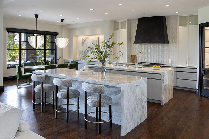
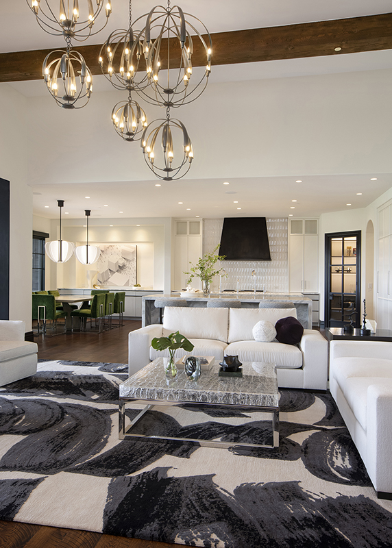
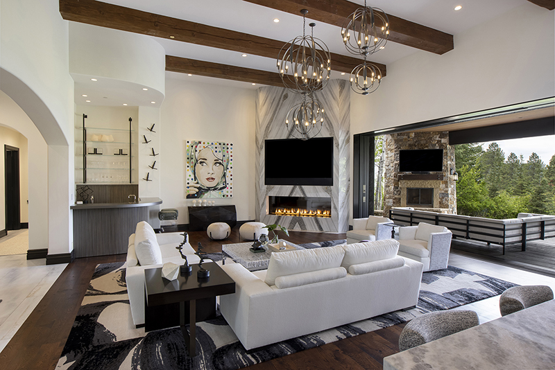
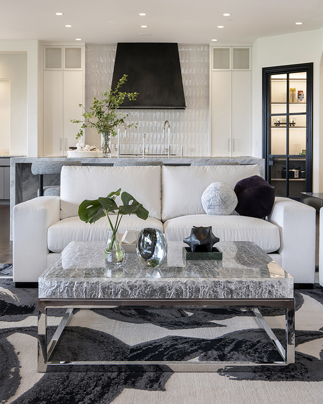
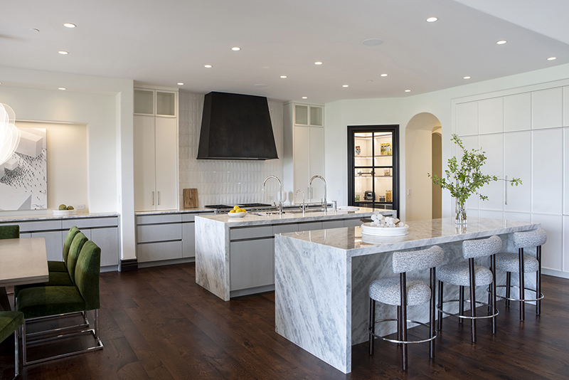
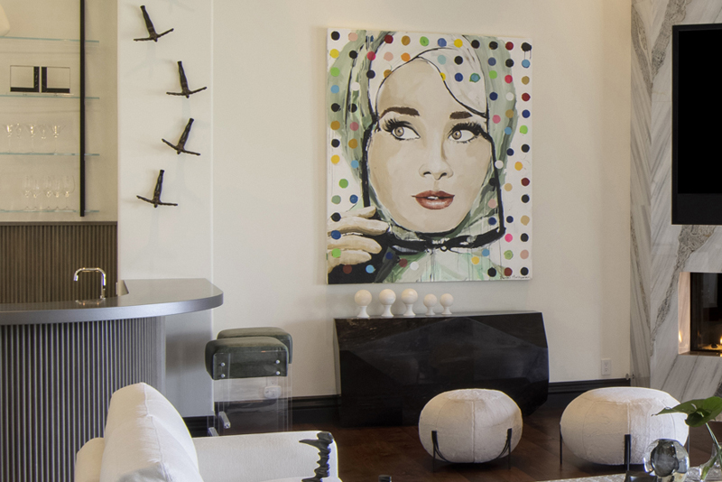
In one of our recent double-award-winnning interior home design projects, there is a great room that opened to an adjacent kitchen and family room, a fabulous pop art piece – covered in bold polka dots – became the spark for the entire space. She wasn’t just wall art. She was the boss.
Audrey didn’t just hang on the wall. She launched a full-on design ripple effect. Her playful, round shapes poured into every corner: sculptural accents, circular poufs, curved pillows, even the rounded stools in the kitchen.
And color? Audrey was the color conductor, setting the tone for a layered colored palette for the home interior that echoed throughout the open concept. The blues and greens pulled from the outdoor views came alive in Audrey’s tones, then bounced to the accent pillows, leapt onto the dining chairs, and landed in the statement art hung above the dining table.
The result? Every space felt connected. Easy. Chic. A truly cohesive interior design like it was always meant to be that way.
Repetition = Rhythm = Relaxation
Subtle repetitions – in both shape and color – are what make an entire space feel cohesive, calm, and collected. They soothe the eye. They expand the sense of spaciousness. They create a quiet, almost imperceptible rhythm that makes the entire home feel at peace with itself.
Here’s why this all works: Your brain is constantly scanning for what’s different. And when it finds too much variety in shape and color with no clear pattern? That’s when your brain goes into chaos mode. But when colors and shapes repeat at just the right cadence? That’s where the sense of calm rolls in.
Repetition creates rhythm. Rhythm creates cohesiveness. And cohesiveness? That’s the special sauce to cohesive interior design that feels luxurious and livable.
How to Bring Cohesiveness into Your Home
Here’s your cheat sheet for designing a home that flows like a dream:
- Start with adjacencies: Consider what rooms connect with each other, and what you see as you move through your home.
- Choose a hero piece: It could be art, textiles, a rug – but it should be something you love.
- Bounce your colors: Let your color palette echo from one room to the next in pillows, upholstery, or accessories. The color ratio will change, the colors will not.
- Repeat shapes with intention: Curves, lines, forms – keep a rhythm going.
- Zoom out: Don’t piecemeal your interior home design and just design room-by-room like each one is its own island! Design your whole home as one cohesive interior design masterpiece.
Make Your Home Make Sense
Cohesiveness doesn’t mean boring or blah or sameness or monochromatic (unless you’re intentionally going for monochromatic which is its own blog post!)
Cohesiveness means beautifully connected with considered adjacencies, where each space supports the next to create a flow that feels natural and elevated all at once. So yes – color palettes for home interiors matter. Shape matters. But more than anything, the relationship between your spaces matters.
Feeling like your home could use a glow-up that gives it a better design flow? The art of making a home feel beautifully cohesive and personalized to you is where a luxury interior design firm can enter the chat with their expertise. Let’s work together to make it sing.
Book a consultation with our luxury interior design team – we’ve got your back and your blueprint.
🎯 Ready to Create a Home That Flows?
Feeling like your home is beautiful… but not quite together? The difference is in the flow. When each space feels connected – by shape, by color, by intention – that’s when your home truly sings.
✨ Let’s design a home that’s not just decorated, but cohesively designed.
📞 Give us a call at 215-736-8693
📩 Or, drop us a line at donna@idhdesigns.com
 Best of HOUZZ