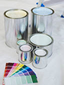
Benjamin Moore 2012 Color Forecast from Yardley based, Interiors by Donna Hoffman
Here in Yardley, the forecast most immediately on my mind is not about Benjamin Moore’s color forecast for 2012…18 months from now. Right now on my brain is how the weather will be for those attendees at the marvelous workshop I’m leading this Saturday at the annual Bucks County Day For All Women. It is equally as deliciously titled: Interior Grace: How to Create Authentically Beautiful Interiors. (11/6, 9am…held at the Bucks Community College Campus. Come on down). No where in this rich seminar, will I talk about color trends, but I know I will get a question on it.
Ah…the trends!
As I guide clients in our work together to create stunning interiors with 10+ year staying power…I admit that I am not a trend-a-holic by nature. I watch trends carefully and with an evaluative eye. I keep fully informed about them. I respect the power of the trend, but I do not teach becoming a slave to them. Yet even with that, in the end, we are all naturally ensnared by trends to a point. That’s becuase as a trend takes firm hold…the fabrics and furnishings readily available to the masses start to reflect that trend.
No where is that more obvious than in COLOR. For example….try searching the mass retail outlets to find a blue with a sweet green undertone to tie into a clients existing furnishings when the profusion of easy access fabrics contain the current trend of blues with a gray undertone. (The solution or course to spend more $$ by going upstairs in price point…in which case you can usually find what you need.) Trends will be trends.
So in respect to color trend, something that affects us all eventually…here’s the 2012 Color Trend forecast from respected paint house, Benjamin Moore:
THE COLOR TREND SCOOP for 2012
This first part is kind of flowery so bare with me a sec. The impending color waves are expected to be “influenced by a cultural focus on Preservation, with four sub themes. They are: Heritage, Process, Protection, and Enlightenment.” What exactly does this mean to the common woman? Not much. (Sometimes my wonderful industry makes me giggle…) So here’s some accessable information for you to enjoy!
2012 Color Trends with Meaning:
Firstly, the Ben Moore forecasters are predicting that in about 18 months, we’ll be seeing color palettes that continue to be reflective the gray and brown scale that we’ve seen over the last few years but:
*Camel & Khaki become the new neutrals upon which richer hues can be layered as accents.
Key Color-Family Trending:
Red:
Walls and furnishings may see range of feminine reds and ‘spot on oranges” all the way to softer vintage pink tones (soft, blush). Some highlighted Ben Colors: Candy Cane Red; Orange, Potpourri.
Yellow:
The 2012 yellows will be golden and sunny, sometimes even in a lacquered shine vs. the previously seen matte finishes. Luminous blonde tones, honey and gold will also emerge. Look for Ben colors like Baby Chick, Hollywood Bold or Metallic Gold at one end of the spectrum and more neutral tones like Subtle, Buttercream Pearl and Turmeric or Bronze Metallic. (you getting the metallic thing here??)
Green:
Lovely green will move to crisper shades, some teal-tinged but also safari and camouflage tones. (If we start painting the walls in camouflage patterns and upholstering furntiure in it…I’m leaving) Ben’s forecasters are pointing toward colors like Fresh Scent Green, Pear Green or Winchester Sage to Dark Olive and Harbour Town.
Blue:
The blue story will be one influenced by water and air in 2012…but offsetting these more chiffon colors we’re told to look for charcoal and blackened navy hues. (Will somebody PLEASE call me to do navy walls in a dining room? I’ve been itching to for about 20 months…any takers??) A few colors to note from the forecasters: Palm Coast Teal, Gold Glory, Serenata and then the deeper tones like Deep Ocean, Mysterious and Gentlemen’s Gray.
This is a tiny sampling of the full “PanSpectrum” put together by their team. For fun – print out this blog post and head to the Benjanmin Moore virtual fan deck and type in the colors above to see them. They’re fun!
The final take-away is this: If you dislike yellow now – you’re not going to love it by 2012. However….expect the colors you do love or resonate with … to slowly morph and take on the tints and shades and undertones “of the day.” You’ll see this most clearly as you scan fabric stores, catalog pages and local retailers not to mention the photography in shelter magazines. In the end, design to what you love. Color is one of the most powerful ways to sculpt a space…and probably one of the greatest areas of error by many folks. Proceed with care!

